

Healthcare Dashboard — Concept Demo
A self-built concept demo of a clinical admin dashboard — dense patient and scheduling data made scannable — not a client project, no real patient data involved.
What this page is: A concept demo we designed in-house to explore this problem space. It is not a client project.
This is a self-built concept demo of a healthcare admin dashboard — not a client project, and no real patient data was used. Clinical interfaces carry more information density than most software: this explores keeping patient status, scheduling and alerts legible at a glance, with role-based views so a receptionist and a clinician see different priorities from the same data.
What the demo works through
- A single scheduling view that reads clearly whether it holds three appointments or thirty — density without becoming a wall of identical rows
- Status and alert states (waiting, in progress, flagged) distinguished by more than colour alone, since colour-only status coding is a common accessibility failure in dashboard design
- Role-based views: a receptionist's screen prioritises who's arrived and who's next; a clinician's screen prioritises case history and flags, from the same underlying data
- A patient-record layout that puts the reason for the current visit above historical detail, rather than making every visit start with a full scroll through the record
The interesting constraint in this kind of interface isn't the data model, it's the reading order — the same screen has to serve someone glancing at it for two seconds between patients and someone reviewing a case in depth, without becoming two separate designs.
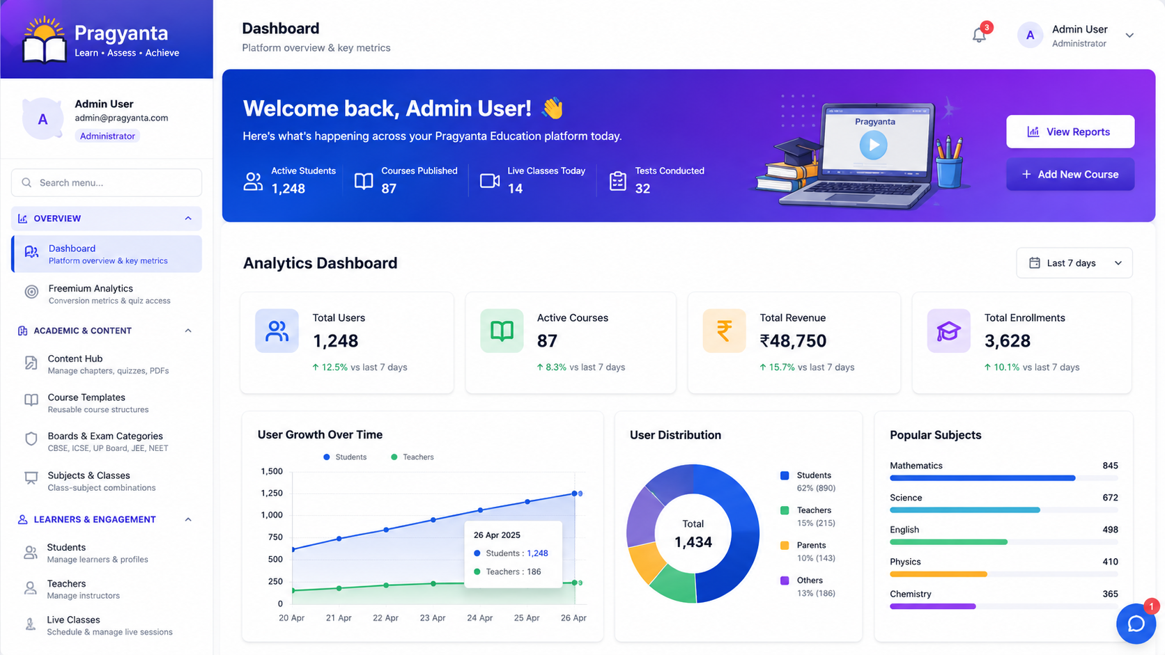
The same problem — many data points, one screen, decisions made quickly — comes up in student and admin dashboards for LMS platforms: completion rates, cohort progress and at-risk flags all competing for the same attention, and the same role-based split (instructor view vs. admin view) applies there too.
We treated this one deliberately as an interaction-design exercise, not a clinical system — there is no real patient data anywhere in the demo, and it was never intended to meet any healthcare regulatory standard. The value was in the density and role-based-view problem, not the domain.
Need a dashboard that stays readable as data grows? Discuss your project.
Planning something similar?
Tell us about your training content or course idea, and we’ll map the fastest route to a real learning platform.
Book a Free LMS Consultation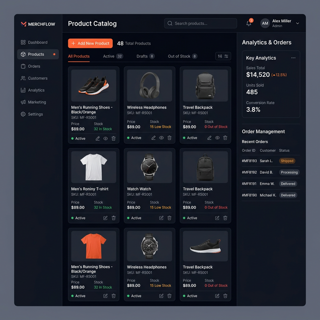
Retail & Commerce UI — Concept Demo
A self-built concept demo of a retail storefront — product grid, filtering, cart and checkout — not a client project, no real inventory or payments behind it.
Read case study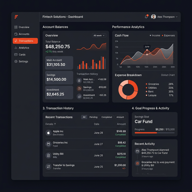
Learning Platform UI — Concept Demo
An early self-built concept demo of course navigation and progress UI — superseded by our real LMS work on Pragyanta, kept here for the interface-design record.
Read case study
Social App UI — Concept Demo
A self-built concept demo of a social feed — post composition, real-time-feeling interactions and notifications — not a client project, no real users behind it.
Read case study