

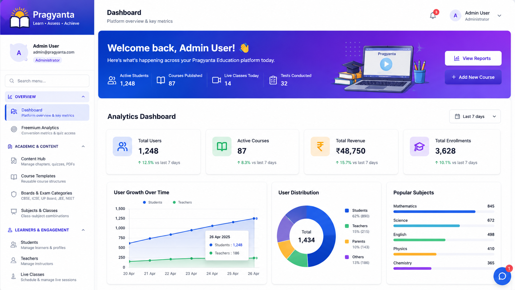
Retail & Commerce UI — Concept Demo
A self-built concept demo of a retail storefront — product grid, filtering, cart and checkout — not a client project, no real inventory or payments behind it.
What this page is: A concept demo we designed in-house to explore this problem space. It is not a client project.
This is a self-built concept demo of a retail storefront — not a client project, and there are no real orders, inventory or performance figures behind it. It explores product discovery and checkout: category filtering that stays fast with a large catalogue, a cart that survives navigation, and a checkout flow trimmed to the fewest steps that still feel trustworthy.
What the demo works through
- Faceted filtering (category, price, attributes) that narrows results without a full page reload, so browsing a large catalogue doesn't feel like starting over each time
- A cart that persists across sessions and page navigation — one of the more common places a storefront quietly loses a sale
- A checkout sequence kept to the fewest fields and steps that still collect what's needed, since every extra step is a point someone can abandon
- Product detail pages structured so the decision-relevant information (price, availability, specification) is visible without scrolling past marketing copy first
None of this is complicated in isolation. What it tests is whether the pieces still feel fast and coherent once a catalogue has hundreds of items rather than the dozen most demos are built around — that's usually where filtering UIs start to lag or checkout flows start collecting more friction than they need.
The same interaction discipline — reducing friction between browsing and converting — is what we bring to course and enrolment websites, where the equivalent drop-off point is signup, not checkout, and to student dashboards, where the same faceted-filter pattern shows up in course catalogues rather than product grids.
A retail catalogue is also a reasonable stress test for interface work generally — it's the kind of surface where a small delay or an extra click gets noticed immediately, because comparing options quickly is the entire point of the page.
Building a storefront or an enrolment flow? Discuss your project.
Planning something similar?
Tell us about your training content or course idea, and we’ll map the fastest route to a real learning platform.
Book a Free LMS Consultation
Healthcare Dashboard — Concept Demo
A self-built concept demo of a clinical admin dashboard — dense patient and scheduling data made scannable — not a client project, no real patient data involved.
Read case study
Learning Platform UI — Concept Demo
An early self-built concept demo of course navigation and progress UI — superseded by our real LMS work on Pragyanta, kept here for the interface-design record.
Read case study
Social App UI — Concept Demo
A self-built concept demo of a social feed — post composition, real-time-feeling interactions and notifications — not a client project, no real users behind it.
Read case study